Every year brings a new colour conversation in the wedding world, but this one feels less like a trend and more like a genuine correction. After a long run of stark white and cool minimalism, Australian weddings are warming up. Tones are softer, more layered, and considerably more forgiving of the light this country is known for.
Soft whites, not stark ones
Pure white has quietly given way to warmer, chalkier tones. Think bone, sand and a soft, slightly warm white rather than the bright, cool white that has dominated stationery and linens for years. It is a small shift, but it changes how a whole wedding feels in photographs, particularly under Australian sun, where a cooler white can read as flat or clinical while a warmer one holds detail and depth.
For couples choosing linens, stationery or a gown, this is worth testing in person rather than on a screen. Warm and cool whites can look nearly identical in a swatch book and completely different once they are photographed outdoors at golden hour.
Deeper tones as the accent, not the base
Alongside the soft neutrals, richer colours are appearing in smaller, more deliberate doses. Deep plum, chocolate brown and forest green are showing up in ribbon, groomswear, florals and place settings, offering contrast against an otherwise pared-back palette. The effect is considered rather than bold. A single deep-toned ribbon on an otherwise neutral bouquet, or one dark, moody flower among a sea of soft blooms, does more work than an entire colour scheme built around it.
This is a useful approach if you are drawn to colour but wary of it dating your photographs. Building a palette around one or two warm neutrals with a single deeper accent gives you room to be bold in small, easily adjusted ways, through ribbon, signage or a groom’s tie, without committing your whole aesthetic to a shade you might tire of.
Texture is doing what colour used to
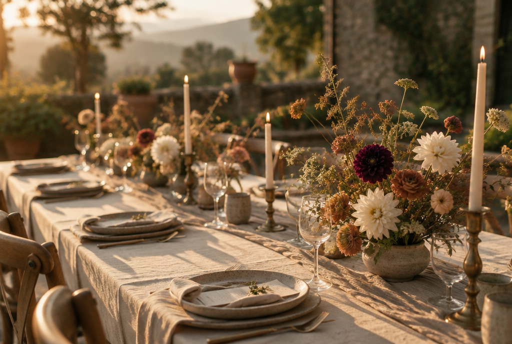
One of the more interesting shifts is how much weight texture is now carrying. Linen, raw silk, hand thrown ceramics and unlacquered brassware are being used to create depth in a way that used to rely on a busier colour palette. A tablescape built entirely from soft neutral tones can still feel rich and layered if the textures are varied enough, from a rough linen runner to a polished stem vase to a matte ceramic plate.
If budget is a consideration, this is genuinely good news. Texture is often more affordable to source and hire than an elaborate colour scheme, and it tends to photograph beautifully regardless of the season or light.
Considering your own venue and season
Before locking in a palette, it is worth spending time in your venue at the time of day your ceremony or reception will actually happen. Light changes everything. A palette that looks considered in a styled shoot at midday can feel entirely different under the golden light of a five o’clock Australian wedding. Bring fabric swatches and flower stems to your venue if you can, rather than relying on a mood board built somewhere else entirely.
Making it your own
The palette worth taking from this moment is not a specific set of colours so much as a principle. Warm neutrals as a base, one or two deeper tones used sparingly, and texture doing more of the visual work than colour alone. It is a forgiving approach that suits most Australian settings, from a coastal ceremony to a stone country homestead, and it tends to age well in photographs long after the trend itself has moved on.