For a long while, the default palette for a considered Australian wedding was a quiet one. Greenery, ivory, the occasional blush. It photographed beautifully and it rarely felt like a risk. Something is changing this year, and it is worth paying attention to if you are still deciding how your day should feel.
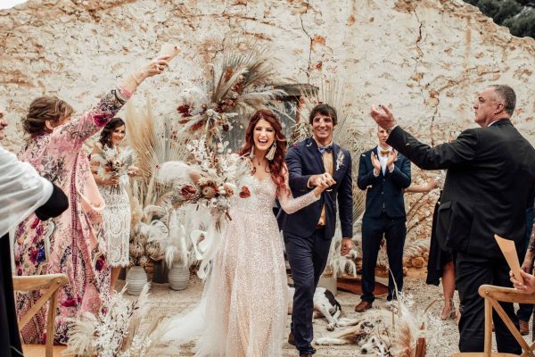
The shift is towards warmth. Couples are reaching for colour with intention, choosing tones that carry mood and memory rather than simply filling a brief. Trend forecasters have been pointing to expressive, sun-soaked hues for 2026, with sunset shades of pink, coral and soft red appearing alongside richer notes like cherry mocha, jade and warm citrus. The effect is less about being bold for its own sake and more about a day that feels alive in every frame.
Why Couples Are Moving On From Neutral
The all-green, all-white look had a long run, and there is nothing wrong with it. The reason it is loosening its grip is that so many weddings began to resemble one another. When everything is pared back to the same soft palette, the details that make a celebration personal can quietly disappear.
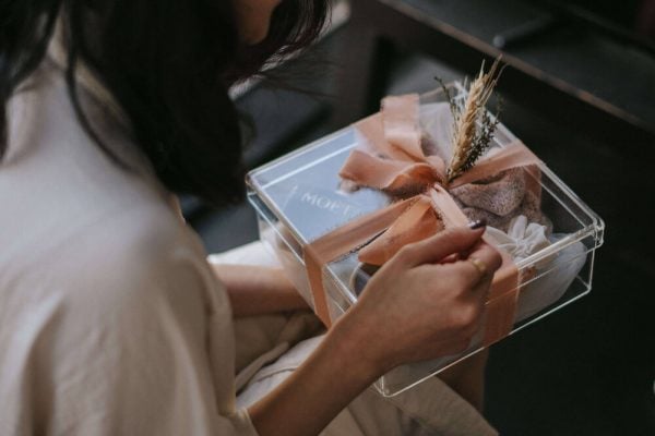
Warmth does the opposite. A terracotta linen, a bowl of ripe stone fruit on a grazing table, candlelight catching amber glassware, these are the things guests remember. Colour gives a wedding a pulse, and in an age where couples want their day to reflect who they actually are, that pulse matters.
Finding Your Palette Without Overwhelming the Day
The mistake some couples make is treating a colourful wedding as an invitation to use every shade at once. The most elegant results come from restraint. Choose one or two anchor tones, then build a small family of supporting shades around them.
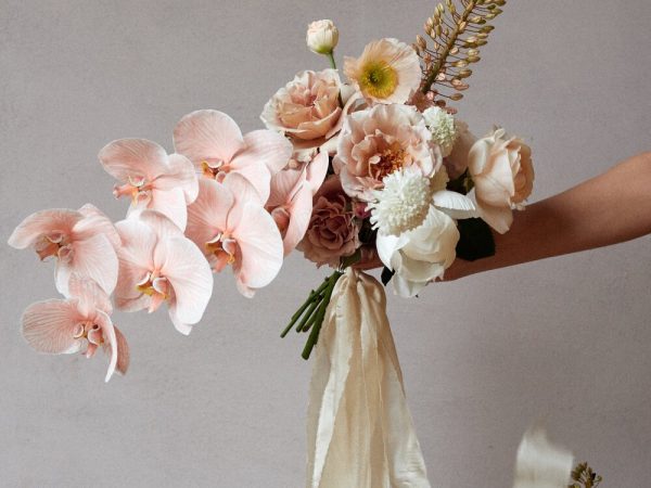
If you love the sunset direction, you might anchor with a soft coral and let it move through dusty rose, warm sand and a whisper of burnt orange. If you are drawn to something deeper, cherry mocha pairs beautifully with cream, soft black and aged brass. The trick is tonal cohesion. When your colours sit within the same temperature and mood, even unexpected combinations feel deliberate.
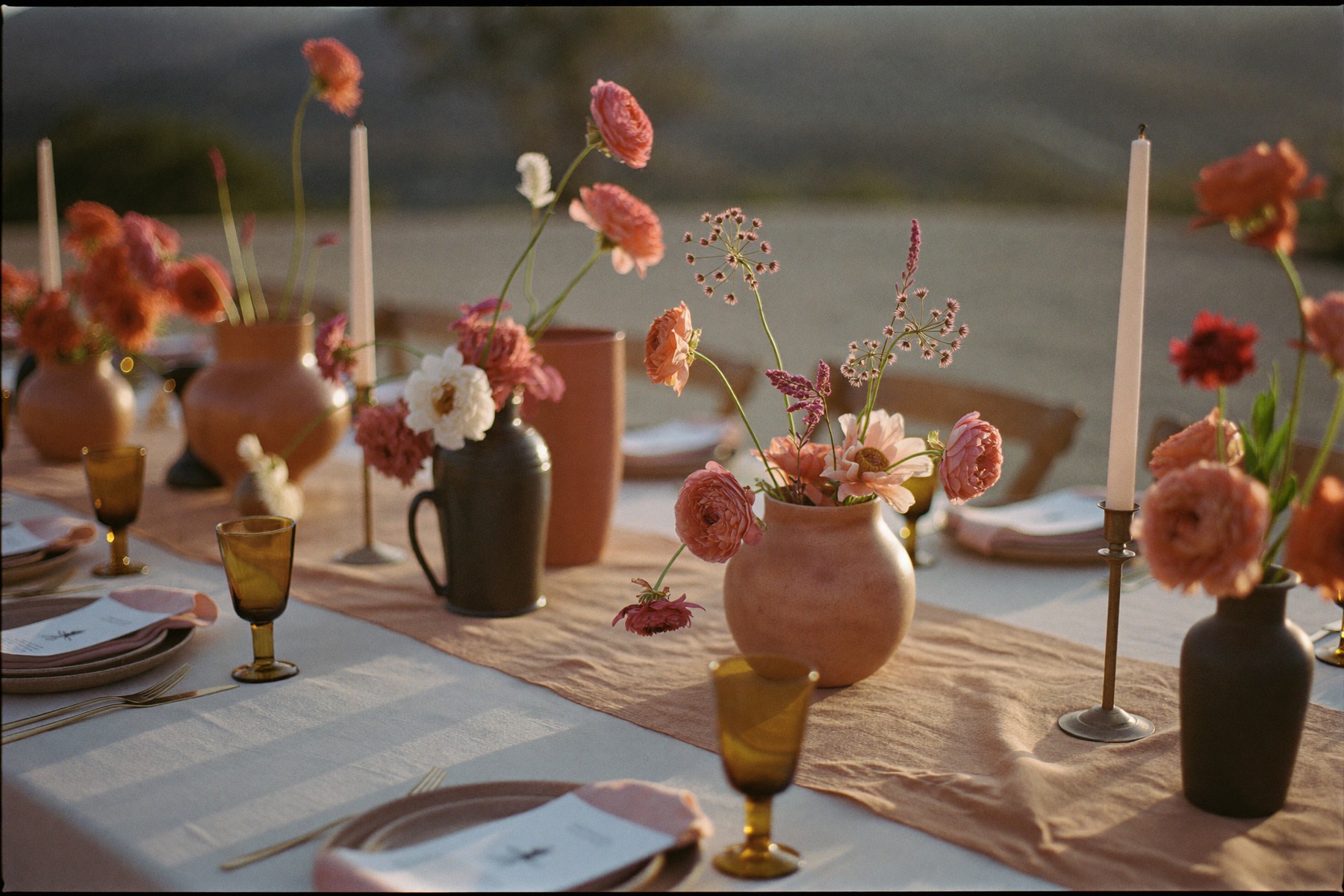
It also helps to think about where colour lands. You do not need to flood the entire room. A considered palette often shows up in the places that catch the eye, the floral arrangements, the napkins and table runners, the stationery, the bar. Leave some breathing space and the colour you do use will feel richer.
Letting the Season and the Setting Lead
Australia gives you a real advantage here, because our light and landscape do half the work. A coastal ceremony in late afternoon already carries golden warmth, so a palette of sand, bone and soft apricot will feel completely at home. A garden wedding in the cooler months suits deeper, spiced tones that echo the changing leaves.
Seasonal flowers are the easiest way to bring this to life, and they tend to be the most beautiful and the most affordable. Rather than asking your florist for a specific bloom you saw online, describe the feeling you are after and the colour story you have chosen. A good stylist will know what is at its best when you marry, and the result will look effortless because it genuinely belongs to the moment.
Colour as a Reflection of You
The deeper trend underneath all of this is personalisation. Couples are designing weddings that reflect their story and their taste rather than a template, and colour is one of the most honest ways to do that. The shade you keep returning to, the tones of the home you have built together, the palette of a place that means something to you both, these are far better starting points than any forecast.
So treat the warm direction of 2026 as permission rather than instruction. If a soft, neutral day is truly what you love, choose it with confidence. If you have been quietly drawn to something with more depth and glow, this is the year to trust that instinct.
The most memorable weddings are rarely the ones that followed the palette of the moment. They are the ones where the colour felt inevitable, because it could only have belonged to those two people. Start with the feeling you want to walk into, and let the colour follow from there.