Most weddings are styled the way most rooms are decorated, with a base of neutral tones and a chosen colour used here and there as an accent. A few flowers in the palette, a ribbon, a candle, a considered pop against all that cream. It is a safe and sensible way to work, and it has been the default for years. A bolder idea is gaining ground for 2026, and it does the opposite. Rather than dotting a colour through a neutral room, couples are drenching the whole room in it.
Real Weddings, writing on 2026 styling, describes colour drenching as one hue used en masse, carried from the florals through to the linens and the lighting to create drama and depth. THE WED points to the same instinct across its 2026 trends, a move towards saturated, committed colour rather than the careful accenting of recent seasons. Done with any conviction, the effect is genuinely striking, and it photographs like nothing else.
What drenching actually does
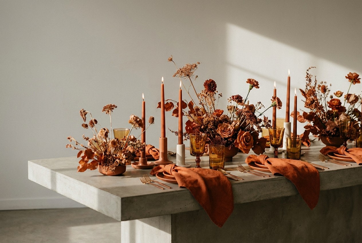
The technique is simple to describe and harder to be brave about. You choose a single colour and you commit to it fully, letting it run through as many elements of the room as you can. The flowers, the table linens, the candles, the stationery, the lighting, even the glassware where you can manage it. Instead of a neutral space with colourful moments, you build a space that is saturated in one tone from floor to ceiling.
What this buys you is atmosphere, and a great deal of it, for less effort than you might expect. A room washed in a single deep colour feels immersive the moment guests walk in. There is no visual busyness for the eye to sort through, just one confident mood that surrounds everyone. Paradoxically, committing hard to one colour often reads as more sophisticated than a room trying to balance several.
Choosing a colour you can live with
The whole approach rests on the colour you pick, so this is the decision to slow down for. Because the tone will be everywhere, it needs to be one that flatters a room full of people and holds up across a long evening. Deep, grounded shades tend to work best for this reason. Think of the tones drawn from the garden and the cellar, a burgundy, a forest green, a terracotta, a dusty aubergine. These have enough depth to feel rich rather than flat when used in volume.
Bright, high-key colours are far riskier drenched. A whole room of vivid yellow or hot pink can tip from bold to overwhelming quickly, and it is unforgiving in photographs. If you love a brighter shade, consider a slightly muted or dusty version of it, which keeps the character while softening the intensity across a large space.
Working in tones, not one flat wash
The mistake that makes colour drenching feel heavy is treating it as a single flat block. The rooms that carry it off play within one colour family rather than matching everything to an identical swatch. A burgundy scheme might run from a deep wine in the florals to a soft blush in the napkins to a near-black in the candles. Staying in one family holds the room together while the range of shades keeps it from feeling like a stage set.
Texture does similar work. When everything shares a colour, the surfaces have to carry the interest instead. A heavy linen next to smooth glass next to a matte ceramic vessel gives the eye somewhere to travel, even when the palette never changes. This is where a good stylist earns their keep, so it is worth talking through early.
Where to be brave and where to hold back
You do not have to drench the entire wedding to get the effect. Many couples apply it to one setting rather than all of them, which is a sensible way to test your nerve. A drenched reception with a softer, more neutral ceremony gives the room a real sense of arrival when guests move through. Concentrating the colour where people spend the most time also concentrates your budget where it shows.
It is worth being honest with yourself about whether you will still love the choice in a decade. A deep, considered palette tends to age far more gracefully than a trend-driven brights, so if you are committing this hard to a colour, lean towards one with some timelessness in it.
Colour drenching asks for a kind of confidence that the accent approach never demands. It means trusting one colour to carry your whole celebration rather than hedging with neutrals. For couples who know the mood they want and are willing to commit to it, the payoff is a room that feels complete and deeply intentional, the sort of space guests remember long after the finer details have faded from memory.